Description
Imagine visualising data with multiple intersections and unions, making drawing insights from a traditional Venn diagram extremely complex! 🤔🤷
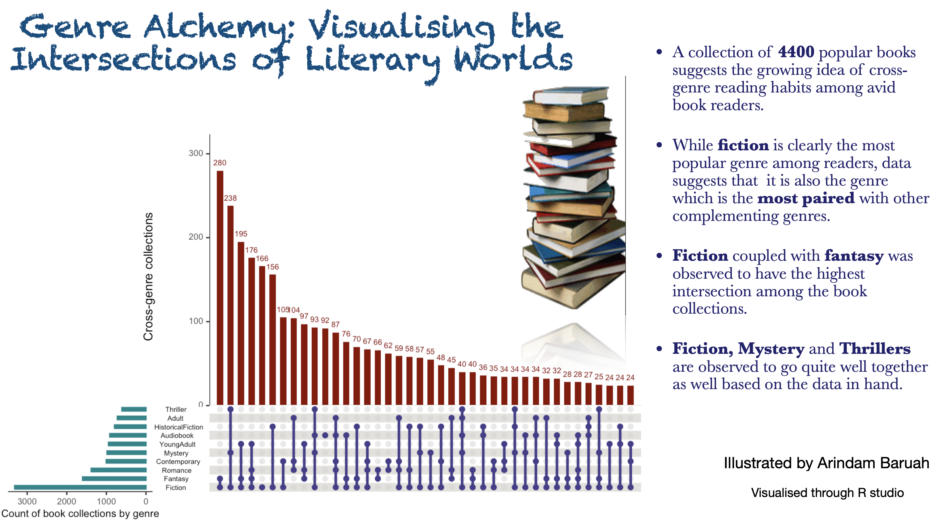
Introducing the Upset Plots! 💡
In this month’s visualisation challenge, I was implemented an “Upset plots”. This utilitarian plot, while not the easiest to comprehend at the get-go, is incredibly useful for studying intersections within our data. 📈📊
The plot works on a combination matrix and creates the bar plot by summing the frequencies of the observations for every respective combination of observations. ⚙️
Here is my attempt at visualising data on the popular book reads between 1980-2023 where we can observe a trend of book choices with inter-genre content. The visualisation was created using the UpSetR package on R studio.
Data source: https://www.kaggle.com/datasets/cristaliss/ultimate-book-collection-top-100-books-up-to-2023
If you’re interested in the code which went behind the creation of the above plot, please refer to the link here.
References
- R studio: RStudio Team (2020). RStudio: Integrated Development for R. RStudio, PBC, Boston, MA URL http://www.rstudio.com/.
- ggplot2: H. Wickham. ggplot2: Elegant Graphics for Data Analysis. Springer-Verlag New York, 2016.
- UpsetR: Gehlenborg N (2019). UpSetR: A More Scalable Alternative to Venn and Euler Diagrams for Visualizing Intersecting Sets. R package version 1.4.0, https://CRAN.R-project.org/package=UpSetR.